CLASS Corporate ID | Myers School of Art
ROLE Concept, Designer, Brand Identity/Voice, UX/UI
TOOLS Indesign, Illustrator, Photoshop
YEAR 2018
DESCRIPTION Student Project. This laidback restaurant and pub is located in the Historic Medina Square, residing in an old bank building that was built in 1891. For this rebranding and buildout project, the unique location of the pub is highlighted and celebrated in the logo including a twist on the old-timey bank robber trope. Bold graphics, contrasting colors, and mysterious type is paired to create a fun and memorable experience for anyone that finds themselves at P.J.’s doorstep. My only question… will this be your new go-to getaway bar?
CLASS Corporate ID | Myers School of Art
ROLE Concept, Designer, Brand Identity/Voice
TOOLS Indesign, Illustrator, Photoshop
YEAR 2018
DESCRIPTION Student Project. Utilizing natural elements and bold colors, this branding establishes Venture as an outdoor lifestyle brand that is as wild as your adventurous side!
CLASS Typography IV | Myers School of Art
ROLE Concept, Layout Design, Brand Identity/Voice, photography (“Going Bold” cover photo)
TOOLS Indesign, Photoshop
YEAR 2018
DESCRIPTION Student Project. Shape Magazine is a magazine with a focus on lifestyle and fitness—empowering women to live life to their fullest potential. Being a magazine with a core message of strength in femininity, the rebranding leaned heavily into that message. The rebrand features a bold, fluid reimagining of the masthead that will easily catch eyes in display cases at stores. This is combined with attention-grabbing photography and an overall more organic, calming tone. Stories of strength, growth, and living life to one’s fullest can now shine and take new life in the publication.
CLASS Corporate ID | Myers School of Art
ROLE Concept, Designer, Brand Identity/Voice
TOOLS Indesign, Illustrator, Photoshop
YEAR 2018
DESCRIPTION Student Project. Utilizing geometric shapes and bold colors, this branding revamp gave a local coppersmithing company the refresh it needed while throwing a nod to its rich history in the area.
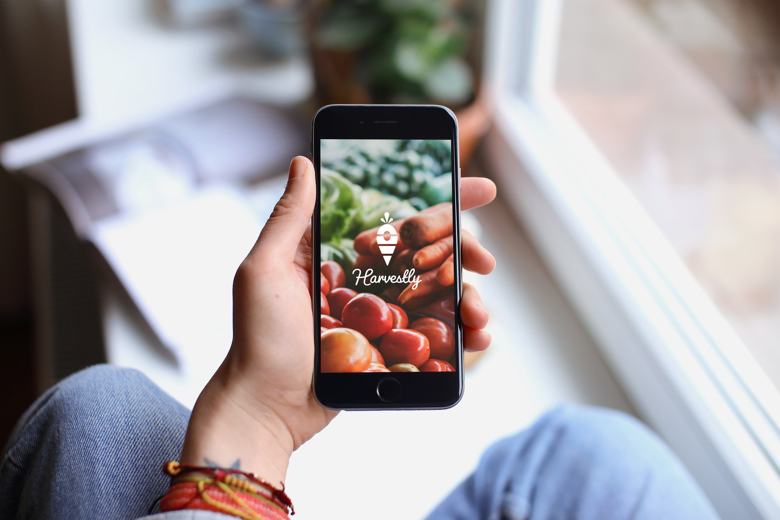
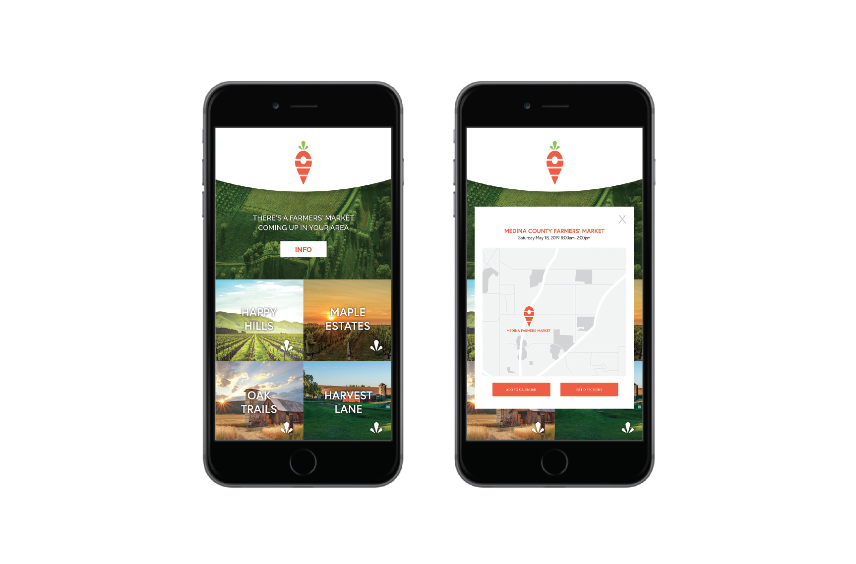
CLASS 4D Interactivity | Myers School of Art
ROLE Concept, UX-UI, Designer, Brand Identity/Voice
TOOLS InVision, Illustrator, Indesign, Photoshop
YEAR 2019
DESCRIPTION Student Project. Harvestly is an app created with the purpose of connecting individuals with fresh, locally sourced goods with ease. From the app, people can find local farms and farmers markets in their area. The UX of the app nurtures the building of a stronger camaraderie between farmers and the communities they serve by streamlining the way they communicate upcoming harvests and events at their farms. Harvestly makes farm-to-table eating simpler for locals, and drives traffic to small businesses.
CLASS Packaging | Myers School of Art
ROLE Concept, Packaging Designer, Brand Identity/Voice
TOOLS Indesign, Illustrator, Photoshop
YEAR 2019
DESCRIPTION Student Project. STROP1924 is bringing a classic twist to men’s personal care in a market that is oversaturated with grooming products. This brand offers consumers a series of kits for shaving and personal care. These kits are intended to be purchased as a subscription. Initially, they’ll receive the whole kit in a multi-use wooden keepsake box. Going forward, they will receive refills on a customizable schedule. The kit featured here is the “Open on Mondays” vintage shave kit. Giving a wink to the fact that barbers always used to be closed on Mondays, this kit provides its users the opportunity to get the experience and benefit of the barber’s close shave without ever leaving their house.
CLASS Design X Nine | Myers School of Art
ROLE Designer
TOOLS Indesign, Photoshop
YEAR 2019
DESCRIPTION This poster was selected for the Spring 2019 UADC Concert. The blurring around the dancer is used to evoke the feeling of motion in a flat, 2D space. A fresh color palette expresses notions of spring, rebirth and nature.
CLASS Typography III | Myers School of Art
ROLE Concept, Designer, Layout Design, UX/UI Design, Photography, Brand Identity/Voice
TOOLS Indesign, Photoshop, Lightroom
YEAR 2017
DESCRIPTION Student Project. Homeward Hound is a campaign to raise awareness for dog adoption. This campaign’s main slogan “Homeward Hound” plays off of Tracy’s Dogs unique non-profit approach—traveling across the United States to deliver their pups to their new forever homes. The ultimate goal of this campaign is to bring awareness to the hardships so many dogs face each day, and how fulfilling adoption can be for both the pet and its owner. The campaign consisted of web applications (both mobile and desktop), magazine ads, outdoor advertising, and a billboard. As a take-home gift for each adoption, new pet parents will receive a personalized collar and leash set, symbolizing the dogs journey to love, family and home.
CLASS Type III | Myers School of Art
ROLE Concept, Designer, Illustrator
TOOLS Indesign, Illustrator, Photoshop
YEAR 2017
DESCRIPTION Student Project. “Brewed Weekly” is a calendar that outlines the various seasons of coffee beans around the world. A perfect gift for the coffee lover in your life when a new espresso machine sounds like it may be a little too much. Every week, coffee-enthusiasts pick a new seasonal coffee recipe to master. Each recipe is crafted so it pairs well with the particular coffee bean that is in season at the moment. The front of the card includes an illustrated representation of the particular drink, while the back includes the written recipe and various facts about the coffee that inspired it. These fun facts include information such as harvest, flavor profile, and a “life of the bean” breakdown.
Who doesn’t love a solid ampersand? These pins were created as takeaways for my senior graphic design portfolio show. The ampersand ties into the style of my branding in both design and color — pulling the flowing elements from my logo and utilizing a rose gold, navy, and white color palette. These pins emphasize my love for typography and clean design. The pins were displayed as a standalone piece as well as being featured on white baseball caps.
CLASS 4D Motion | Myers School of Art
ROLE Concept, Design, Animation, Voiceover
TOOLS Adobe After Effects
YEAR 2018
DESCRIPTION Student Project. “The Nature of Process” takes a quote by Saul Bass and brings to life the words he is saying visually through the use of motion. Stylistically taking cue from the nature of successes and failures that occur during the ideation and sketching process, the video is in a limited color palette of white, black, and red — reminiscent of good ol’ fashion paper, ink and editors marks. The fluid nature of the red editor’s mark carries the viewers through video, and visually enhances the words being spoken.
CLASS Typography IV | Myers School of Art
ROLE Concept, Designer
TOOLS Indesign, Photoshop, Illustrator
YEAR 2018
DESCRIPTION Student Project. Instagram Unfiltered is a proposed event for the leading social media influencers on the platform. For this event, influencers would receive a personalized invitation box in the mail. On the outside, the box is fully branded and recognizable as instagram. Once opened, influencers will find a completely tailored interior celebrating them and their brand. Interior graphics include the influencer’s instagram feed lining the box, where a print invitation is displayed. The box will contain a QR code band that give’s influencers access to the event and simplifies networking, a clip on phone filter to swiftly change the tone and color of your photographs in real time, and lastly a “frame the shot” enamel pin that plays on the classic motion of getting the perfect shot. This event would be an ideal time for Instagram to unveil upcoming launches for the brand, tour the studios and their photosets, as well as receiving real life feedback on how top users are interacting with their app — giving a truly unfiltered look into the brand.
CLASS Illustration | Myers School of Art
ROLE Concept, Handlettering, Illustrator, Color, Design
TOOLS Wacom Tablet, Illustrator, Photoshop, Indesign
YEAR Spring 2018
DESCRIPTION Student Project. Mother Holle is a classic fairytale from the Brothers Grimm Collection. This project reimagines the classic tale for the 21st century with a new storybook cover and character illustrations. The mystical nature of the story is captured on the cover with sparkling elements. Significant parts of the story are represented as elements throughout, pulling on the symbolism of the feather in the story and the main character being transported into another world after falling down a well. Handlettering of the words “Mother Holle” add a whimsy and child-like element to the cover. Bold, contrasting colors and mysterious silhouettes are used to draw readers in as they scan the bookshelves for their next favorite fairytale.